Showing posts with label color. Show all posts

Wednesday, June 11, 2008

Create Your Own Kelly Grid Art

Today I’ll show you how to weave paper together to create grid art like that of Ellsworth Kelly. Make sure to look at some of his paintings for inspiration.

Supplies Needed:

Construction Paper
Ruler
Pencil
Scissors
Glue
A note to parents/teachers: Younger kids can enjoy this project, too. Just prepare the paper ahead of time.
Cut one-inch-wide strips of colored construction paper. You only need one strip of each color but you’ll want to use a variety of colors. Now, measure and mark one-inch-wide, vertical strips on a piece of white construction paper. Fold the paper in half so you can cut along the lines. Do not cut all the way to the edges!
Weave the strips of colored paper through the slits. When you’ve woven as many strips as will fit, glue the ends to the back of the white paper and cut off any extra colored bits.
If you are feeling especially creative, weave the left over pieces of colored paper into the strips you’ve already attached.
Hang and enjoy!

I’m off to Tennessee until Wednesday. I’m not sure how often I’ll post while I’m away but I hope you enjoy the rest of the week!

Return to main page.

Tuesday, June 10, 2008

Ellsworth Kelly

Ellsworth Kelly is the final color field painter I plan to post about at this time. He is still living so I’ll just give you a quick summary of his life.

Kelly was born in 1923 in New York. As a child he moved a lot. Moving makes it difficult to develop friendships so Kelly was sometimes lonely. To keep him busy his grandmother taught him to bird watch. Kelly was very interested in the birds and he began to study them. John James Audubon’s work, which you may remember reading about, helped Kelly in his study of birds. Watching birds made Kelly sensitive to color and influenced his art later in life.

Another experience that influenced Kelly’s art was his army service. During World War II he spent a lot of time around camouflage. This helped him learn to use shadow in his paintings

When he got out of the army, Kelly moved to Boston where he studied at the School of the Museum of Fine Arts. Two years later he continued his art education in Paris.

In 1954 Kelly returned to New York. His art was not accepted right away. It was very different from the other works of art created during the time. Even so, people saw that there was something special about what he was creating. He was among the only artists who used more than one canvas in a single painting. He also used shaped canvas. Kelly even created entire paintings using only one color.

What I really love, and what I wanted to show you today, are Kelly’s colorful, random grid paintings. Some Kelly created by lining up small, square canvases, each painted a different color. Check out this one. For others, like this one, he drew and then colored in the squares.

Tomorrow, I’ll show you how to make your own grid art.

Return to main page.

Thursday, June 5, 2008

Use a Compass to Create Your Own Stella Masterpiece

Sorry for the posting delay. We had tornados yesterday and a lot of the area lost power. I did my best to stay out of the apartment as long as possible. Not to worry: everything’s fine now.

A note to parents/teachers: For your enjoyment, I am posting a second math-related project inspired by Frank Stella’s work. This one is perfect for practicing using a compass. Compasses can be tough to use at first and when students need to create circles of specified size it can be even tougher. This is a fun and artistic way to practice.

Begin by teaching the students a new term: concentric. Concentric circles are two or more circles within each other that have the same center point. Concentric arcs are two or more arcs lined up next to each other that share a center point.

Supplies Needed:

Paper
Pencil
Compass
Colored Pencils or Crayons
Black Marker (optional)

Place your compass point somewhere on your paper and create a large circle. Your parent or teacher may ask that the circle be a certain size. Make sure it will fit on the page before you begin. If you’re doing this project on your own, choose for yourself what size you want your largest circle to be.

Now, set your compass to a smaller size. Place the point in exactly the same place on the page. Remember that concentric circles must share a center point.

Continue to create smaller and smaller circles inside the large circle.

When you’ve created as many circles as will fit inside your large circle, move your compass to another point on the paper and decorate the blank spaces with concentric arcs or smaller concentric circles.

Finally, color the spaces between the circles with colored pencil or crayon. If you wish, trace the pencil lines with black marker to make them stand out.

Return to main page.

Wednesday, June 4, 2008

Use Geometry to Create Your Own Stella Masterpiece

It’s easy and entertaining to use Frank Stella’s art to review geometry. The project below can be fun for elementary students in grades 1-5 with only small adjustments depending on the level of the students.

Supplies Needed:

Posterboard
Construction Paper
Pencil
Scissors
Glue Stick
(Optional) Geometric Stencils

A note to parents/teachers: I recommend creating some stencils out of cardstock if you plan to do this project with children in 1st or 2nd grade. Even older kids may benefit from tracing the shapes rather than drawing their own. Draw circles, triangles, squares, rectangles, hexagons, and octagons onto cardstock, cut out, and make the stencils available to the kids. You can easily adapt this project to your kids and situation by creating fewer shapes (ex: only circles, triangles, and squares) or more shapes (including trapezoids and parallelograms).

Choose which shapes to use in your artwork. You may choose to use as many or as few of each shape as you’d like. Trace the stencils onto colored construction paper and cut out your shapes. Older kids can practice drawing their own shapes onto construction paper and cutting them out.

Arrange your shapes onto your posterboard. When you are pleased with the art you have created, glue the shapes in place.

Cut away any extra posterboard to create a shaped canvas just like Frank Stella.

Another note to parents/teachers: You may wish to have the kids write an explanation of which shapes they used. Ask them to write how many of each shape they used and something about each of those shapes. For instance, if you’ve been learning that circles are enclosed shapes with no sides, have the kids write that. If you’ve been learning how to find area and perimeter, have the kids measure the shapes they used in their art and figure out the area and perimeter of each.

Check back tomorrow for another math-related Frank Stella project.

Return to main page.

Tuesday, June 3, 2008

Frank Stella

Today our look at color field painters continues...

Because Frank Stella is still alive and painting, I’m not going to say much about his life. He was born in 1936 in Massachusetts. He attended Princeton University where he studied history. He was also interested in art and he visited museums and painted. After graduation he moved to New York where he still lives.

Stella’s paintings are meant to be objects themselves. He does not mean to portray any subject you would recognize and he doesn’t try to paint emotion onto canvas. He wants each painting to be a unique paint-on-canvas (or wood, or aluminum, etc.) object.

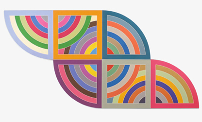
Many of Stella’s early paintings are extremely orderly. You’ll notice straight or curved lines that repeat in patterns. For example, look at Sunset Beach Sketch and Harran II. Can you guess which painting Stella created using a protractor?

Stella began painting on strangely shaped canvases which were often better suited to his creations. Check out Sunapee I, for example.

Soon, Stella’s paintings began to take on 3D shapes. He started attaching pieces of canvas to wood and building his paintings outward using aluminum and fiberglass. Look at The Pequod Meets the Bachelor which was made from aluminum and magnesium.

Finally Stella started to create sculpture. Click here for one 10 ton example.

Stella’s paintings can easily be used to review some simple math concepts. Tomorrow I’ll post a fun project that can be enjoyed by elementary school children of any age.

Return to main page.

Thursday, May 29, 2008

Mark Rothko

The first color field painter I’ll post about is Mark Rothko. Rothko did not begin as a color field painter but he his best known for the paintings he did in this style.

Rothko was born in Russia in 1903. He and his family moved to Oregon when he was 10 years old. They struggled for money. Rothko did well in school and earned a scholarship to Yale University. He thought he would become an engineer or an attorney—careers at which he would make some money. In 1923, his second year of college, Rothko left Yale.

He moved to New York City and became involved with some artists. He began taking classes at the New School of Design. Arshile Gorky, whom I wrote about earlier, was one of Rothko’s teachers.

Rothko’s early paintings were somewhat realistic. They showed some recognizable objects such as people, buildings, and landscapes. (For an example click here.)

In the 1940s Rothko became interested in using mythology in his paintings. He thought he could best paint emotion by showing known creatures from myths. These mythological paintings were similar in style to Surrealist paintings. (For example: The Syrian Bull.) It didn’t take long for Rothko to decide that mythology was outdated. He began to believe that too many artists had already used myths in their paintings. He was also convinced that painting myths wasn’t the best way to show emotion in his art.

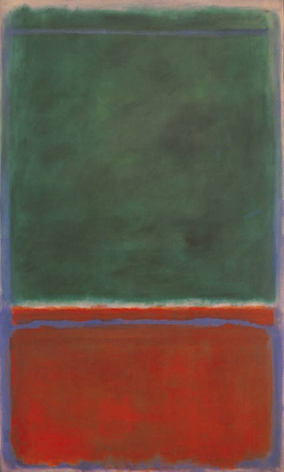
Mark Rothko’s art became more abstract at the end of the 1940s. He decided that simple shapes were the best for showing complicated feelings. The large, simple shapes allow you to feel instead of think when you look at Rothko’s paintings. (Examples: here, here.)

His later paintings, those from 1948 and later, show only two, three, or four rectangles lined up one of top of the other (vertically). He painted these color field paintings on huge canvases because he wanted the viewer to get lost in the painting. He didn’t want you to stand back from his paintings and look on. He wanted you, instead, to stand close and become a part of the artwork. He wanted you to feel the emotion he had painted. (For images click here, here.)

Beginning in the late 1950s, Rothko used much darker colors. He overlapped colors until the canvas was covered with deep reds, blues, blacks. He was painting sadder, angrier moods than before. (For images click here, here.)

Rothko died in 1970.

Return to main page.

Thursday, February 28, 2008

Complementary Colors

According to the Oxford English Dictionary, fifth edition, a complementary color is “a color that combined with a given color makes white or black.” This is something you can test on your own. Use yellow, red, blue, green, orange, and purple. Mix two colors at a time in as many combinations as you can think of. What are your results?

To make the idea of complementary colors easier to understand, I am linking to a color wheel. Go look at it before you continue reading.

Complementary colors lay exactly opposite each other on the color wheel. In the simple color wheel you just look at, yellow is complementary to purple, red is complementary to green, and blue is complementary to orange.
When complementary colors are place next to each other, both look bright. This has been used to great effect in many paintings. Below, look at van Gogh’s use of red and green in Night CafĂ© (above).
Renoir’s use of blue and orange in Boating on the Seine.
Yellow and purple in Degas’ Woman Drying Her Hair. (This was painting at the end of Degas’ life when his eyesight had begun to fail.) Look how much more intense the yellow in the wall is than the red when placed against the purple of the woman’s body.

Try placing complementary colors side by side in your own painting and notice how bright the colors look.

Return to main page.

Tuesday, February 5, 2008

How We See Color

I have gone far too long without posting about how we see color. Color is an important aspect of many forms of art including paintings, sculpture, drawings, and collage. Imagine a painting of a fruit bowl in which the apple is orange, the grapefruit is turquoise, and the orange is burnt sienna. How would you know which piece of fruit was which?

A blob of green paint is not itself green. Sound confusing? We see objects because there is light (from the sun or the moon or from light bulbs) to illuminate them. This is true of color as well. That blob of green paint looks green because it soaks up all the light waves except the ones that ones that are the right length to look green.

Have you ever hung a prism in a window on a sunny day and seen little rainbows bounce on the walls? The prism filters the white light by slowing down the waves and reflecting them in different directions. Some waves are slowed more than others. The slowest (longest) waves look red and the fastest (shortest) waves look violet. That blob of green paint acts kind of like the prism except that instead of releasing all the waves, it absorbs some. The make up of that paint allows it to reflect the green waves and absorb all the others.

Because it is light that allows us to see color, our eyes will blend red with blue if small dots of each color are placed close together. This is the idea that Georges Seurat used when he experimented with pointillism.

Also of possible interest: Paint Your Own Pointillist Picture

Return to main page.